Thanks for the constructive input. What you wrote is actually fairly interesting to me, so let me address each point separately and maybe you could give me some additional viewpoints on the things or advice, as you seem to have a pretty solid grasp on these things.
The reason I want to avoid using just text by itself, is due to the background. As I wrote in some of the previous comments, some of them are very dark and it would make it very hard to read. I might change the color of the text, but honestly I dont wanna do that, as I am striving for a certain uniformity of the layout and the way its displayed. The colored text background serves only as a sight buffer. You glance over the sig. and your eyes are instantly locked on the easy to read player ID numbers (easy to read when compared to numbers without the color buffer). Its not the most elegant solution but it certainly is a valid and easy to implement one. I am trying to make it practical rather than "just pretty". The text bar islef is intentional.Originally Posted by Soltrec

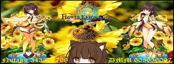
The tool I am using is the Zoner Photo Studio 13. As for the distortion it sometimes happens during the process of making each picture fit. I am using 950x472 Wide/Hight pixel rate for the Full sized ones, and 600x220 for the Signatures (this is the size I came to after experimenting for it to be comprehensible, but not take too much space on the screen.). Some of the pictures are either much smaller, or in opposite, multiple times bigger, so resizing them according to the pixel count may cause some of them get distorted a bit.
Some of them are created through me finding the flower I want to use in a much bigger picture and cropping it out, and then working on it, instead of the parent pic.
Borders....hmm yes that might work. Honestly though I am not a big border fan in pictures myself, (unless its the paling out ending in white yet visible line (or darkening into solid black frame, that also works), it might add to the overall effect.
I will give it a try, but considering the tool I am using It would be better to get a fitting image of the borders from somewhere and use that. Any recommendations ?
Not serious at allI just felt like making these. In the beginning it was just for my own use, later for some more people I consider forum friends. But eventually since bunch of people use just random cut snippets of Print Scrn (some dont know how to make a better sig, some dont have the time, and some just dont care, etc.), I got the idea of offering these to whoever might want one. Its fast to do and looks more personal than just some random cut out.
By no means do I try to be professional here, and while I certainly try to make it better as I go on, given that I do these for fun, and whenever I have some extra time on my hands, it goes only as far as to not cut into my RL time and the hobbies I have.
From what you wrote I have a hunch that you might be either well versed or possibly even a pro - or at least much more invested - when it comes to things like image editing and such, so your standard is definitely set up much higher than mine.
My standard is something more akin to: I'll be making these for as long as people enjoy them, is all.
+ Reply to Thread
Results 41 to 50 of 145
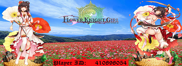
- FKG
- Flower Knight Girl Integration
 |  |  |  |  |
 |  |  |  |
-
Last edited by Myrdin; 09-25-2017 at 07:59 AM.
-
Advertisement
-
Generally speaking, text should never be in your face when it comes to a signature. Unless it's a text signature. It should be visible, readable, but not overbearing. Text bars just do not look good, even if they are intended to be a fix. Why? Because they are overbearing (i.e., they are disconnected from your image and in your face). Originally Posted by Myrdin
Solutions are difficult, not impossible. I'm not sure how much you can do though. You're not using Photoshop so this makes it even harder to explain. Generally you don't add that much text to a signature. If you do, there are workarounds. For instance, instead of having all of the text in one place it gets separated (i.e., Nutaku and DMM). Just looking at your signature, I can see that there is space above each character. If you splice the text, you can put it there.
The benefit of that is that it also becomes more visible than at the bottom, since you'd be looking at both characters faces most likely. Changing fonts and text sizes might also be something to consider. It's not worth having a fancy font if it's difficult to read. You said you don't want to change text colour. That might be impossible for certain backgrounds, but that depends on which ones you use. I'd say different coloured text is better than text bars. By quite a big margin too. You said you wanted uniformity. Well, different coloured text bars aren't uniform, are they now? And they look much much worse than different coloured text, that you can be certain of.
My recommendation for borders is 1-3 pixels on all sides or top/bottom. Generally black or white, but you can experiment with different colours if they fit. You can make them more extravagant, but I find flamboyant borders to be a distraction. Personal flavour. Originally Posted by Myrdin
A pro...Oh boy. Nah, not really. I've dabbled with Photoshop signatures a bit, but I am just a bambi. The observations I made were more along the lines of: ''there are some very basic signature standards that should never be broken''. Like sacred rules by signature Gods. Not much more than that. If you're willing to invest the time, it's pretty easy to get the basics down. Originally Posted by Myrdin
-
I see.
Well yes, I have not yet dabbled into Photoshop myself, so there are certainly limits of what I can and can not do.
I find the idea of the IDs being placed above the character heads intriguing. Though personally in this case the "up your face" was intentional, I will give this a go, since your point about it being overbearing is a good one. I will play around with it, coz now you got me thinking about it, and there is a merit in testing everything to see how it performs, some of that might stick.
Please keep in mind I never done signatures in my life before (always just used text, and maybe found some pic on the internet), so I do not know the "proper etiquette" to Signature creating
I'll try the changes you suggested on my own sig. and will upload it here when done for consultation, if you'd be willing to take a look at it at that time
Edit: Yes, you made me look alright
Last edited by Myrdin; 09-25-2017 at 10:28 AM.
-
For what it's worth, I rather like the text bar; but would suggest making it semi-transparent if possible. Or, what about ditching the bar and using colored text and a contrasting color outline on the text similar to custom names on this forum?
As for the position of the text, I prefer it centered at the bottom. I personally wouldn't want text above the character; for someone like myself who only plays on Nutaku, it would end up looking lopsided.
-
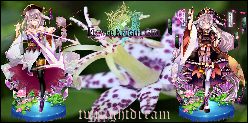
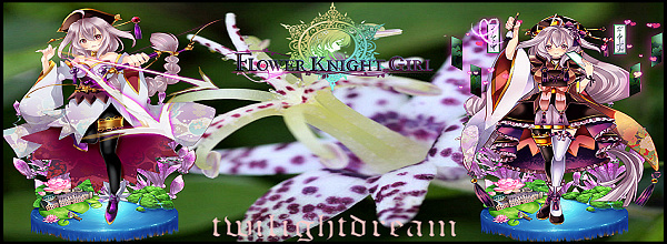
And I am back after a long pause.
I tried to play with some concepts and re-worked the Signature for twilightdream as per PM.
Since he didnt wish for his Sig. to include ID I opted for some changes and tried to improve the overall concept. Mainly the removal of both white frames and the use of bigger transparent colored text on the bottom.
*The problem is the FKG logo is to transparent on a darker picture, just as I feared its hard to see, sigh.
Toad Lily
*For people who already have one of my signatures. Should you like the new setup, I can redo yours with the transparent logo and text.
So let me know.Last edited by Myrdin; 10-22-2017 at 07:46 AM.
-
What I used to do for text in signatures long ago, was to find two contrasting colors or shades within the image, set one as basecolor for the font (use the color picker!), and the other as a very thin outline. Usually, I picked the lighter shade as a basecolor, with the darker shade as an outline, but occasionally the other way round worked out better.
That way, you usually get two colors that won't clash with the image, while the result is generally fairly readable because either the font or it's outline will usually have a contrasting shade against the background.
So in for example the Toad Lilly siganture, I'd probably pick a very pale yellow from her unevolved garter as the main color, and a very dark shade of purple from the bottom of her evolved dress as the outline color.
The pale purple from her evolved stocking as basecolor with the orange from that piece of her evolved dress as an outline color might work too, by the way.
-
tl;dr
Just picked up a few lines cuz I'm lazy. But from what I could see, here's my opinion as someone who had his time with photoshop and this kinda stuff: Signatures with lots of visual appealing stuff on it will never blend well with text, because there will always be too much color, making it 'impossible' to make a text viable. It could only work a little better with small text with a font that follows the flow of the signature and has its principal color in a darker tone.
But anyway, your style is pretty good already. No one is demanding a piece of art to score #1.
Also, the transparent Logo(without white background) looks much better.Last edited by Handu; 10-14-2017 at 04:27 PM.
-
Thanks for the feedback guys.
Since I am not using photoshop the amount of stuff I can do is limited. I tried to fiddle around with it, but the program I am using is very simplistic and does not allow for stuff like Text outlines (I wish it did tbh). If I could that would make the whole thing much easier.
-
I'm still using a very old version of Photoshop, which didn't have very convenient text outlines either. However, it does place new text on a new layer, and the layer does have an outline feature, which basically gives the same result. (to be honest, I still miss my old JASC Paintshop Pro 7.04. It was way more intuitive than Photoshop, which had, and still has, way too many totally useless features cluttering the interface). Really wish I could still get that specific version somewhere, immediately after Corel took over, that program went to hell. Originally Posted by Myrdin
-
I use a mixture of Elements 6 (very old but it works), Photoshop, Inkscape, and GifScript to do my stuff. It works well enough for most projects.
Flower Knight Commander | IGN: Ampchan | FKGID: 300316473 | Discord Name: Ampchan
Total Power: 658K | 41/52 Current Allies | Level 165 | FKG Discord Channel
-
Advertisement
 Reply With Quote