Hi Myrdin, finally got the time to post here.
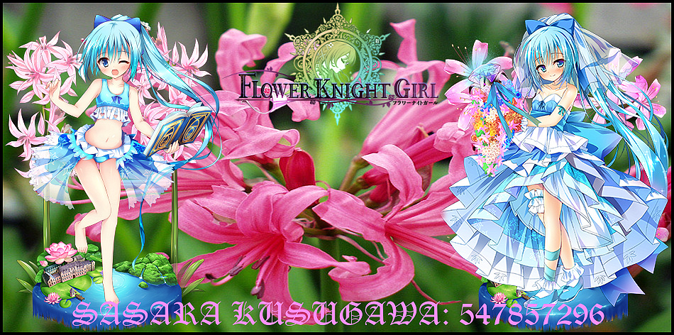
So, yes, I would like a Nerine signature. Btw, I would like to ask a special request, if you don't mind. Can you do the Nerine signature like how you did for Twilight? What I mean is, combining both versions of Nerine, the 6★ and the 5★ one. Reason is because when I was thinking about Nerine (June Bride), both her pre-evolved and evolved forms feature her facing to the left so I don't feel like it's uniform if you place them both together. However, if you combine the 6★ evolved version (on the left) with the 5★ evolved one (on the right), then I think it will look nice, just like how you did for Twilight. *waiting to see the moffu side of the force*
Here's my Nutaku ID: 547857296. I think I'll like to go with the option of putting in my forum name with the player ID, since I'm using the same name for both of them. Something like this; SASARA KUSUGAWA: 547857296
Oh, before I forget, I also did some research on my own. You can use it if you like it. Personally, I love this image. It's got some space on the left and right, and the colour of the flowers showcased here looks absolutely gorgeous. Seriously, I've never adored pictures of flowers this much before. So, you wanna use it, or not? (I think you're gonna use it, hehe XD)

+ Reply to Thread
Results 51 to 60 of 145
-
-
Advertisement
-
Request noted.
Sure it can be done. There is not that many people around here anymore, and not everyone wants a signature so I think combining them wont hurt.
Should be able to get it tomorrow or during the weekend.
-
And here it is.
Since you added your own picture to the request, I used that one. While I would have used the Bloomed artwork personally if it was me, you asked for the Evolved.
As for the text I went with a brighter color. I wanted to use bright blue but it didnt mesh well unfortunately.
Nerine
*I applied a new concept recommended to me from the previous conversations, that being adding borders to the signature.
It looks good. Kinda gives of the feel of those magnet stickers you buy on a vacation and then put on the fridge or something, which is neat moff moff :3
I think this is the standard I will be using from now on. While the issue with the bottom text still remains (mofu grrr >3), I think the overall quality of the signatures improved over the first ones I made.Last edited by Myrdin; 10-21-2017 at 02:09 AM.
-
You might want to add a larger border though, this small one is great, but would look cooler if larger. Bear in mind though, adding border to all sides isn't as appealing as adding to the upper and lower sides. Adding to the left and right might look good too.
Anyway, I'm not here just to give advice :] I want a sig too!
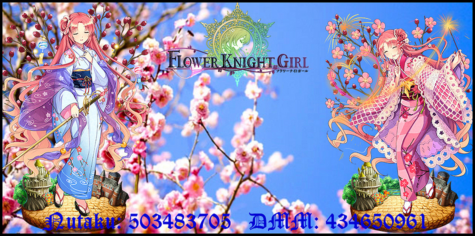
I'm not too picky with this stuff and like to leave the art to the artist, so feel free to do as you wish. Btw, the waifu I want is Mei Plumblossom(Yukata). DMM ID and Nutaku are on my signature, ya pick on whether put both or none.Last edited by Handu; 10-21-2017 at 07:07 AM.
-
Hi Handu
Of course m8
I didnt respond yesterday, but having some time right now, your request has been noted and completed.
There were several good pictures, but some of the really nice one had horrible resolution. In the end I choose this one. I am a sucker for panorama or pics that partly show sky.
For the color of the text, I wanted to go with bright pinkish, but that didnt work out with the background without any outlines.
Black worked really well, but I didnt want to go full dark colors so rather than straight on black I went with deep dark blue instead.
Mei Plumblossom (Yukata)
While I hear you with the border argument I tried both the horizontal and vertical borders only, I do prefer it like this (OCD`s a bitch ), coz it looks a bit more uniformed with border alignment on each side.
**Also I learned a trick or two, thus making slight improvements, But overall I did find out that I need a newer version of the software.... I am using version 14, and in version 15+ you CAN add outlines to your texts... God damnt !
So I will be most likely trying to get my hands on a never one, before I do any more updates.Last edited by Myrdin; 10-02-2018 at 01:43 AM.
-
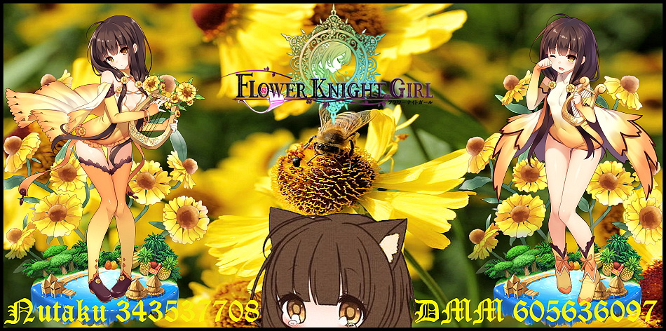
Edited my own Sig to fit in with the updated theme
Helenium
Last edited by Myrdin; 10-22-2017 at 03:15 AM.
-
Ohoho that looks awesome. Didn't know she had a bloom form already and boy isn't that beautiful! Now I wanna get her on both DMM n Nutaku already :[
Anyway, really damn good, loved the background pic and the font didn't hurt my eyes to see the ID. Thanks man, keep improving cuz I know ya can get even better.
Cheers.
-
Hallo hallo.
I see you started using borders. Noice. Looks sexy. Someone already mentioned this, but you could just add top and bottom borders without the side ones. It's more of a taste preference than anything. Up to you. I personally like 4-way borders, although smaller than yours.
So currently there's a few major problems that you have on your hands.
#1. You are combining a background image of a real life flower with anime art style girls as renders. Generally speaking, that is not going to work because one is disconnected from the other (i.e., the flow is ruined). I know that you are trying to keep in touch with each girl being a representation of a real life flower, but it might not be worth it. I mean, look at Nerine. She's supposed to be pink/red/white and yet she's blue of all things. Whoever made her must have been colour blind.
What I'm getting at is that using hand drawn flower backgrounds might reduce the disconnection between the background and the renders. The downside is that you probably won't find the specific flowers you are looking for.
#2. Your font is still... well... off. ¯\_(ツ)_/¯
But more to the point, you need to ask yourself this - are all of those numbers really necessary? I mean, you could just add them beneath the signature. I know you might want them in the signature, but they are a distraction from it. On top of that, now that you removed those text borders, the background is blending with the text.
#3. You should start thinking about colour composition. Choose 1-2-3 focal colours from your render and use them only. Right now there might be too much colour variation. Especially if those colours aren't complimentary. I'm not sure if it's easy for you, but if you ever decide to get PS, it will become a must.
-
Welcome back :P
Thanks, yeah I played around with some of the concepts you talked about before and tested things out within the limitation of the current software I have and the overall effect improved a lot compared to the first signatures I made here. Now I will be upgrading to ZPS 16 since I learned it has some more utility and quality of life improvements over the v.14 I am using, but I honestly dont have the time nor imminent intent to start learning and using Photoshop, so this also addresses one of the points you wrote below in your comment.
*The new version also has text outlines, I´ve seen some videos and with those options I can finally get the text to work within the confines of the picture and make it be easy to read, and not blend into it to much while also maintaining the appropriate color scheme thus avoid disturbing the signature itself.
As for the font..... meh, its fancy oui ! *Insert obligatory Gentleman meme here*
As for the Background thing - that was the main intention and the reason why I started doing them like I do. To you it might feel disturbing but to me it makes thematic sense since I was aiming for the contrast between the real life flower and the anime picture.
Certainly I could go shopping for some animated backgrounds but first off that defeats the whole theme I tried to establish, and secondly - its incredibely hard, nah... its impossible to find drawn picture of all the flowers. Heck in some cases its hard to get a real life photo of a flower that I feel is good enough (though that might be just my personality acting).
Now I might drop the whole flower background which would give me massive freedom, since I could literally use anything and everything... but again - that defeats the point I am trying to make in those signatures.
The thing you made looks nice and shiny, but I am not aiming for something similar to that. The amount of time I have to spend on these is rather finite, and while I want them to be as best as they can be within the limits of time and effort, meaning I am trying to improve upon the design, the moment it start to be to demanding to make I would have to drop it and just not make them anymore.
Right now I can make a pretty decent looking signature that fits the bill withing 5 minutes if I can get a good background picture quickly. It takes much longer if I cant find one that fits my taste for the work. So you could say I have the proces automated in a way.
Again, I apppreciate your imput and I want you to know that and I am sure it works well for what you were trying to achieve with it.
Regardless of how dismissive what I write might sound. I hope my explanation as to what I want to achieve and how much I am willing/am able to invest in it doesnt come off as me pretending to know better or not wanting to accept criticism and feedback, coz that iss really not how I want to come across as. Thanks for taking the time and giving some more advice, the current improvement to the signatures were mostly due to you chirping in and showing me the basic ropes of "signaturing".
Cheers !
********
Big Update (kinda): Anyone who has one of my former design signatures > I will be updating them to the current new design, prioritizing the claimed ones first. While I hope to get them done all by tomorrow its possible it might not be so. Anyway, this is to let you know that the new improved designes are coming, and if you want to change your current sig to the new one, refer to the OP of this thread for the update. (Really glad I made that post, helps to keep all of it nicely in one place, and easy to access to.). So just check in at the end of the day tomorrow or the day after tomorrow for the update to your signature.Last edited by Myrdin; 10-22-2017 at 11:10 PM.
-
Nah, it's fine. Shoulda just told me you were going for something to be done in 5 minutes. I wouldn't have even brought up most of my criticisms if I knew that earlier. In any case, good luck to ya.
-
Advertisement








 Reply With Quote

