Nothing more to say about that....kinda werid.
+ Reply to Thread
Results 1 to 9 of 9
Hybrid View
-
The virgin of the ocean - girl has two mouths
-
01-10-2017 #2Unregistered Guest
I think it's meant to be a red cheek. The Housemaid has a few scenes where she also has a red cheek like that in the "evil castle"
- - - Updated - - -
pretty sure its not about the cheek, more like there are a second pair of lips shaped on the left side besides the already existing opened red mouth....doesnt make much sense
-
-
01-11-2017 #4Unregistered Guest
"not a mistake"
...
You can say that, but that's definitely not how it looks.
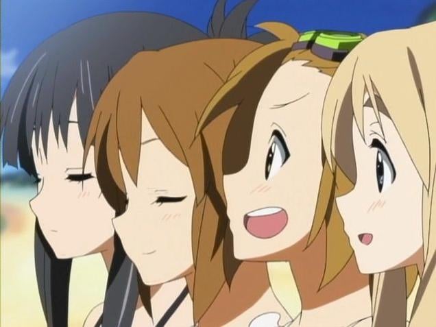
The 1st and 2nd girls in that image look fine, for the most part. They look like they've got their faces at an angle pointed towards the camera. The position of the nose kind of seems off center (actually looking more and more like it's poking out from the cheek the more I look at it... needs more definition, just a bit of a line sticking out towards the mouth (like how the first girl has a bit of a line poking up to define the top of the nose) would significantly change how that looks) but that's the worst that can be said about those two. There's no trace of more than one mouth. It's a fairly straight line from the chin to the nose to form the shape of the cheek.
The 3rd and 4th girls each clearly have two mouths, probably three (one hidden from view) if we assume symmetry. They look like they're looking directly to the side from the camera's point of view. The front of the face is captured in their profile. You can see the two small but distinct bulges in the line between the chin and the nose, clearly the shape of the lips on the front of the face. The noses look fine for them because they're clearly positioned on the front of the face and directly over the proper position of the mouth for that angle. And then there's a gaping hole in the cheek that's visible to the camera... You can't see that as NOT being a second mouth.
- - - Updated - - -
Slight correction: This is done on the 2nd girl as well. And another detail making those two look like they're facing partially towards the camera while the other two are facing directly to the side is the fact that you can see both eyes on the first two girls and you only see the one eye closest to the camera on the other two.
Anyway, the details in the game's drawing are even more distinct than anything in that example. Head turned to the side. Camera looking straight at the side of her face. Mouth open and forming a very distinct break in the line from the chin to the nose. Enough detail in the shape of the nose to see the nostril closest to the camera. And... gaping hole in her cheek...
- - - Updated - - -
(It's kind of neat that the board automatically merged my two posts, but why did it copy-paste the entire original post when I did NOT include that entire part in my second post?)
-
01-11-2017 #5Unregistered- Guest
watching at this picture it feels like it was PLANNED to show a side-view of her face, but someone just put a mouth on her cheek.....now matter how you look at it, it just feels werid
-
-
01-14-2017 #7Unregistered Guest
If you see this frequently in multiple comics / shows, does it ever stop looking like absolute crap to you? Because that's what it is. It may be "the style" but that doesn't mean that it doesn't look bad.


 Reply With Quote


 a lot of artist paint like that, it has become a part of the style to have a mouth like that, see: