


Hey guys.
So after much thought, I decided make this thread and throw these out there.
So what is this whole thing about you ask ? Well ... ?
Its the Custom Signatures Workshop of course ! Moffu :3
Ever wanted to show your love for you Wiafu while also having her promote your ID for your future new allies, but just dont know how to make something like that ?
Thats where the Custom Signatures Workshop comes in to save the day !
~tam tadaa tam tam taaaaa~~~~ Yaaai !
***
.
..
...Right, bullshit and the non existent CG and orchestra aside, lets get to the point shall we ?
So how do I get one ?
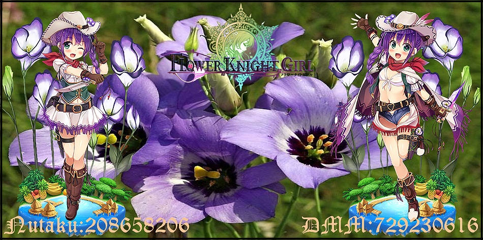
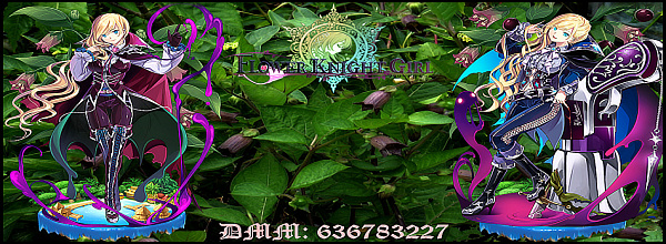
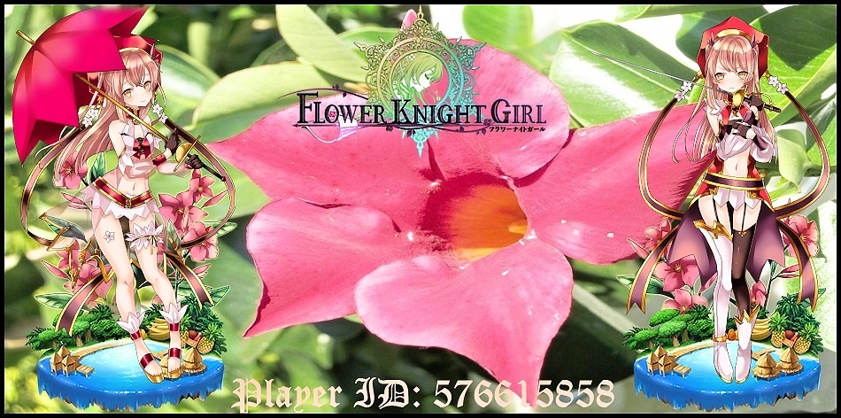
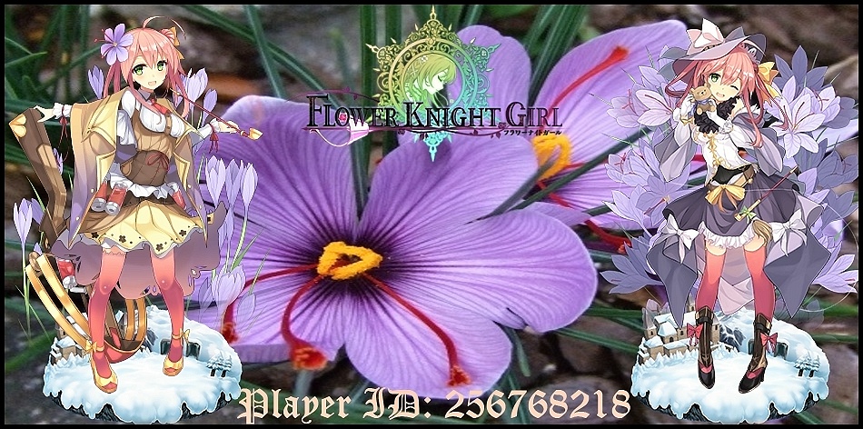
Its very simple. Under the spoiler tabs you can see the Signatures I made for some of the forum members as a reference.
If you would like to have a Signature like this you need to do just two things:
*Let me know in the thread or via PM (though thread is better, might not notice the PM) which Flower Knight Girl would you like showcased in your signature.
*Your player ID > This can be your Nutaku ID, DMM ID, both, or none at all, in which case the bottom line stays empty for you to fill in anytime you want.
*There is also the option to put in your Forum Name instead of the player ID, if you would like it to be done like that let me know in the comment.
** These signatures are primarily done for the HBC FKG community here. While I would prefer you not take them outside this forum, I dont mind if you wish to take them to other boards, for example to HimeUta or anywhere else, but please be open about it when requesting and give credit if asked about.
However for the sake of listing, you need to be a registered member, so I can assign a name to the final product.
If you are an Unregistered member either please register or leave your nickname with your request.
Atm I am still fairly apprehensive to create these for Unregistered requesters.**
***
How to get it to work: Right click the picture to get the URL. Got to your account settings to Signatures and put the URL in the signature text box with the [img]text[/img] format, simple as that. Dont use the "signature" options below. It wont work, just take the line IMG signature IMG and copy paste it into the text window.
***
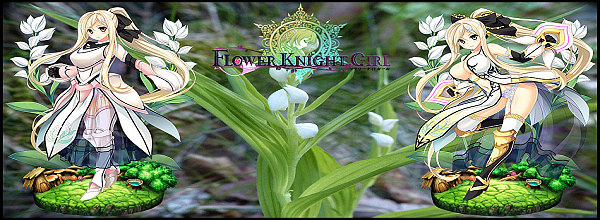
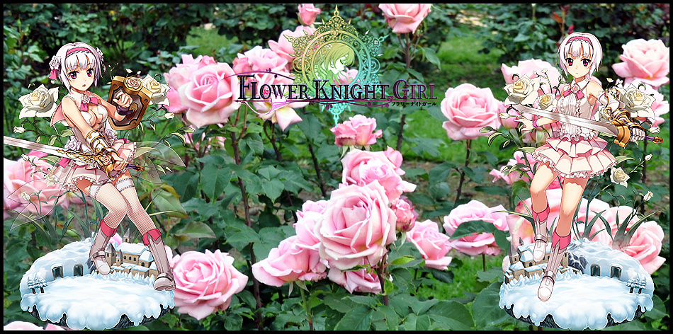
Examples:
Claimed by Forum Members
Skasio - Dancing Lady Orchid (Bride)
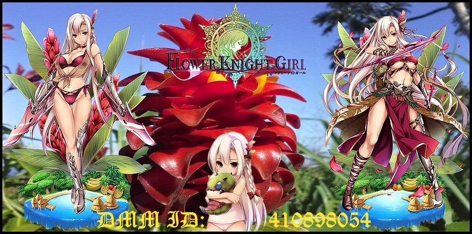
Kurenai - Alpinia
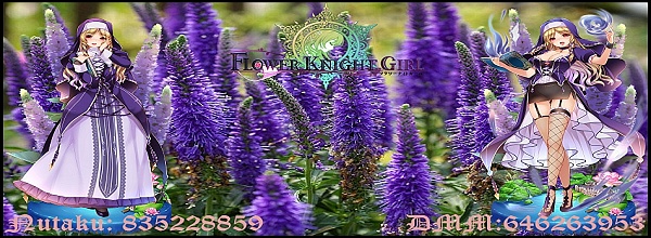
Hungry Hunter - Veronica (Nun)
My own - Helenium
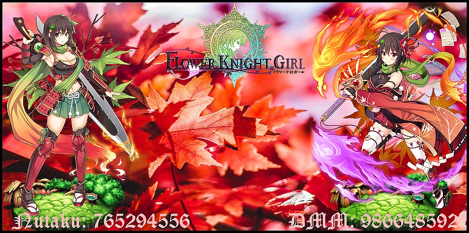
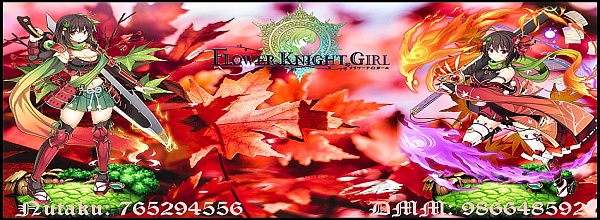
Wutan - Maple
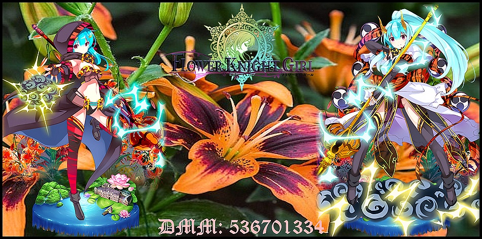
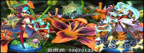
ShadwNinjaX - Tiger Lily
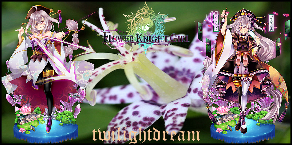
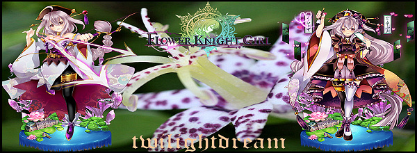
twilightdream- Toad Lily
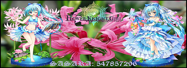
Sasara Kusugawa- Nerine
Handu - Mei Plumblossom (Yukata)
Ceekay - Texas Bluebell
Caitlenren - Belladona
mega94all - Dipladenia
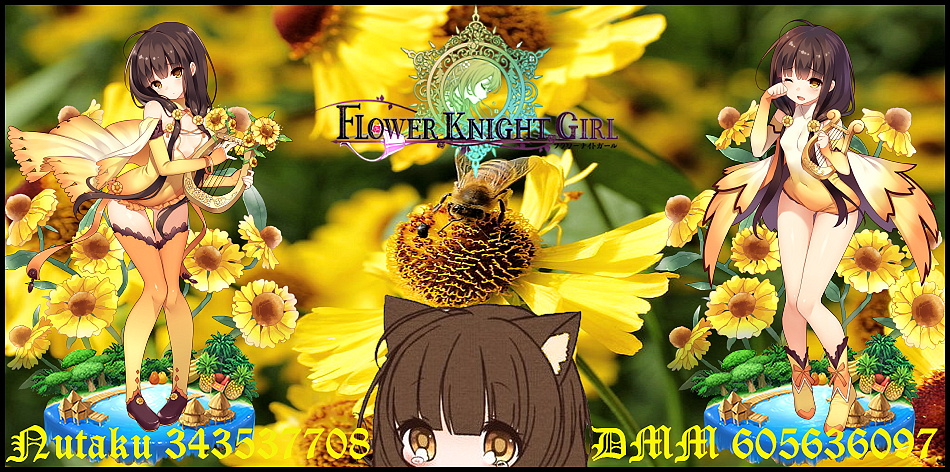
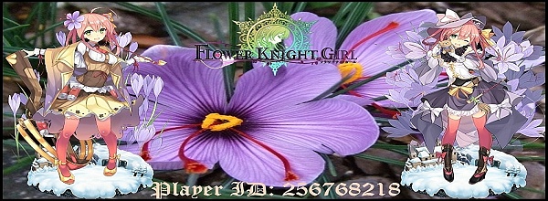
Sound- Saffron
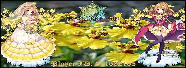
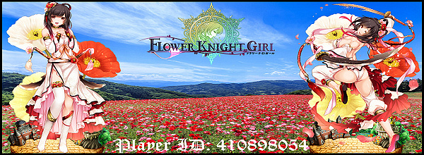
Taon - Poppy
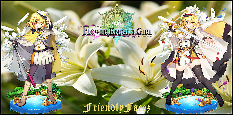
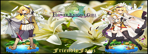
FriendlyFacez - Lily (original name on the FKG Wiki), a.k.a Madonna
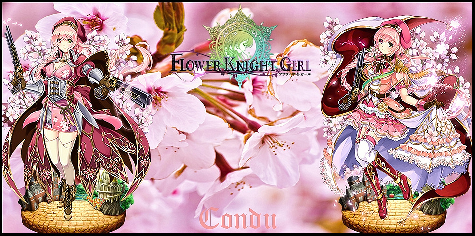
Condu - Sakura
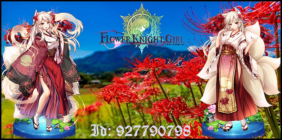
whosyourdaddy - Red Spider Lily
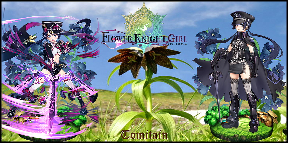
Tomitain - Chocolate Lily (Friti)
**************************************************
Not claimed yet
Unclaimed - Wax Wine (Xmass)
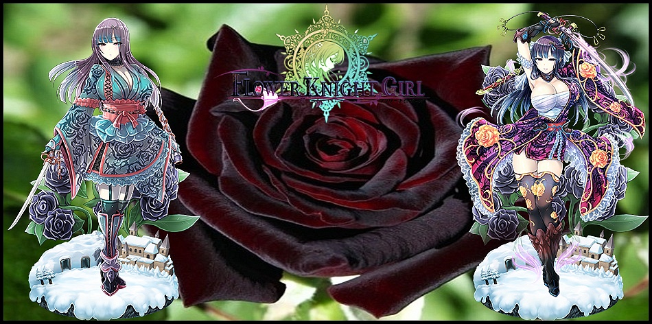
Unclaimed - Black Baccara
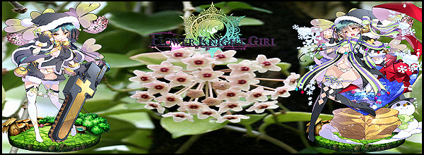
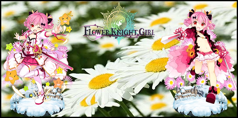
Unclaimed - Daisy
Unclaimed - Cepha Lanterna
Unclaimed - Rose Diana
**************************************************
If you like what you`ve seen, dont hesitate to request a Signature. I enjoy doing these so if you worry about bothering me or something, don't. I wouldn't be offering this if didn't enjoy it. I`ll happily make one for you once I get some time to do so.
**Should you feel like the font size in your signature is to small, or hard to read, being blurry or whatnot, don't hesitate to write me a PM. I have been updating some of the signatures with bigger font size to make it easier to read (especially in case of my older signatures), this also applies for signatures that have darker colored text window.**
Disclaimer: I can do the same girl multiple times in case if someone already you to it, but as explained in a comment on the next page, it might not be always possible to get it to a satisfying result, in which case I will decline the request and you`ll have to choose a different one. Different versions of the same girl (like a 5* and 6* version for example) are fine though, but the same rule applies.
Also I cant guarantee the date of completion, I am doing these when I have some extra time at hand.
*If you are using one of these and enjoy my work, feel free to put "Signature done by Myrdin" in tiny letters underneath it as a sign of appreciation or at least say to say thank you, though I will not force anyone.
Or you can copy paste this line that Taon made that also serves as redirection to this thread when clicked:
Use the following, but remove the slash in "[/URL=" and the slash in "[/I]":
[/URL=http://harem-battle.club/flower-knight-girl/3854-myrdins-custom-signatures-workshop.html][/I]Signature by Myrdin[/i][/url]
Results 41 to 50 of 145
- FKG
- Flower Knight Girl Integration
 |  |  |  |  |
 |  |  |  |
Threaded View
-
Myrdins "Custom Signatures Workshop"
Last edited by Myrdin; 10-02-2018 at 01:44 AM.


 Reply With Quote