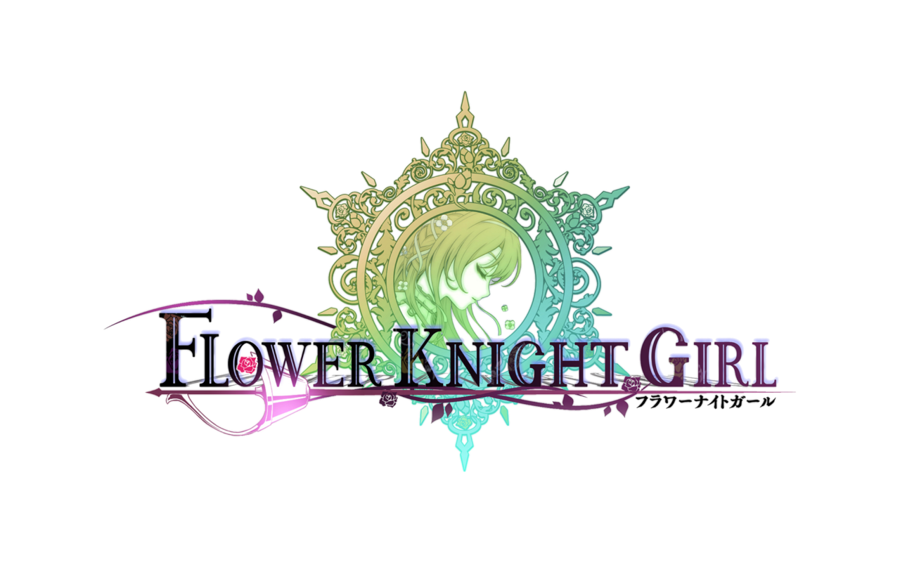
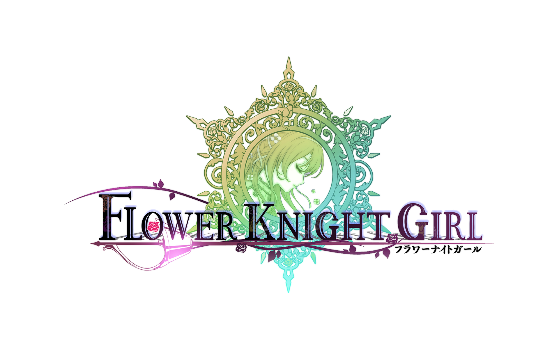
I did a new version of the transparent FKG logo:
Still not perfect due to my not that good skills but far much better than the first one.
In higher resolution but with more flaws:
Everyone is free to use it, I need no credits or nothing. Just please, is this one, not the first one.
Myrdin> Can I try a sign in your style with my logo? I want to try it in real situation.
+ Reply to Thread
Results 1 to 10 of 145
- FKG
- Flower Knight Girl Integration
 |  |  |  |  |
 |  |  |  |
Hybrid View
-
-
Allright so multiple things going on, lets address it one at a time.
Transparent Logo:
I was short on time and to tired yesterday so I didnt get the chance to upload my prototype of the new Sig. with the transparent logo > it still uses the first one I got from maotd. For the new logos I took the blurrier one as in the process of making a signature I resharpen the whole thing multiple times over and over again until I get the overall visibility I am aiming for.
Testing it out, the new blurrier one is much better in this role, as the one with better res. gets to pointy and edgy once it goes the whole treatment.
The overall feeling I get is that it works rather nicely, and if anyone wants their signatures reworked, I am willing to do it, but since I have to do it form the scratch (I have all tools, pictures etc saved and prepared though so it is indeed possible) I will need the time for it and the correct mood since I will be redoing it for the XY time in some cases. Also do bear in mind that not every sign can be done, as I explained the darker background dont mesh well with the logo and blurred it out quite badly. I could play with the filters, but that usually completely changes the tone of the final product, not to satisfactory level most of the times I am afraid. But strictly speaking = yes its possible.
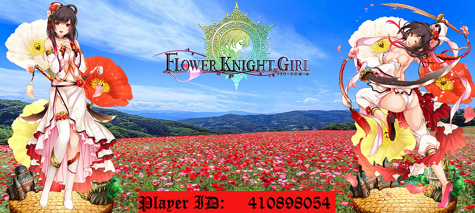
The prototype Signature, new theme and Taon's request :
After consulting with Taon it was agreed upon to try the new format for his signature. Mainly the transparent logo. I had it completed yesterday already, but as explained above, I didnt get to upload it, so it had to wait until now.
Now usually the background would be filled with the corresponding flower, either singular or in multiples. But seeing as Poppy is the type of flower that is always surrounded by friends and is rarely seen on its own, and add to it the fact it tends to grow in the mountains and hills I decided to go with the panorama.
THIS is the result, and I am very pleased how it turned out:
Taon - Poppy
Not only is the background rather nice, but I chose it because it works well with maotd's transparent logo, the blue sky being the perfect example of how it performs.
Now this was an experiment to see how the different theme setting works with the new setup, and while I personally think the final outcome is very satisfactory, thats my subjective thinking. The one thing that would be subject to change is the size of the logo, as I think making it smaller, by around.... 20% would be better. Now it works for this one, but overall I think I go with slightly reduced size in the future.
Taon do let me know if you want to claim it, or go with the standard theme instead (with zoomed in flowers - singular or multiples).Last edited by Myrdin; 09-25-2017 at 12:17 AM.
-
Do I want to claim it...let me think- shut up and take my money! Seriously man, that turned out beautifully and I'd be honored to make use of it. Thank you very much!
 Originally Posted by Myrdin

Also, thank you maotd for your work on the logo!Last edited by Taon; 09-25-2017 at 01:01 AM.
-
And now you've got me to tart my profile up with an avatar and custom name while I was at it. Thanks again guys.

-
You're welcome ^^
Don't worry it looks great ! (not biased opinion in the slightest )
)
Poppy claimed. Updating OP (in case there are still some poeple who didnt figure it out, OP in this case doesnt mean Over Powered, but Opening Post > meaning the first comment in this thread).
Important Update !
Requests that arrive after today will be postponed until the next week Tuesday.Last edited by Myrdin; 09-25-2017 at 01:05 AM.
-
For anyone wanting to credit Myrdin's signature per his request in the OP, I'd like to share this with you; it combines the credit along with the link to the OP. Just copy the following line and add it after your picture (and delete the / in front of URL and the / in front of I (leave the lowercase url and i alone)):
[/URL=http://harem-battle.club/flower-knight-girl/3854-myrdins-custom-signatures-workshop.html][/I]Signature by Myrdin[/i][/url]
-
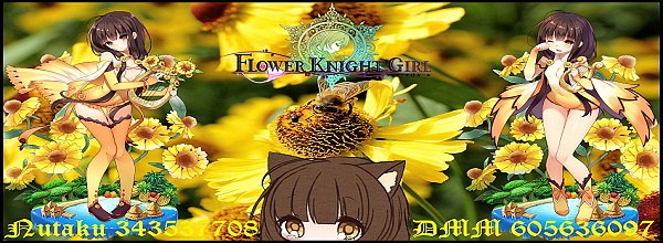
Well, at least you started blending the FKG title text. That's a good start. I'd suggest doing the same with the player ID and numbers too. Those bars just do not look good at all, I'm afraid.
Some of the resized versions also seem to be distorted. Probably from the resizing process. Not sure what program you're using, but there's generally an option to prevent that. Even more so, you could just make the originals smaller to circumvent the problem entirely.
I would also suggest adding borders. If not on all sides, maybe top and bottom. Would make the signatures look more professional.
Not sure how serious you are with this signature workshop and all, but there's my 2 cents. There's plenty of other additions that would nice (i.e., lighting, effects, character blending) but aren't always necessary. Still, good luck to ya brotha.
-
Thanks for the constructive input. What you wrote is actually fairly interesting to me, so let me address each point separately and maybe you could give me some additional viewpoints on the things or advice, as you seem to have a pretty solid grasp on these things.
The reason I want to avoid using just text by itself, is due to the background. As I wrote in some of the previous comments, some of them are very dark and it would make it very hard to read. I might change the color of the text, but honestly I dont wanna do that, as I am striving for a certain uniformity of the layout and the way its displayed. The colored text background serves only as a sight buffer. You glance over the sig. and your eyes are instantly locked on the easy to read player ID numbers (easy to read when compared to numbers without the color buffer). Its not the most elegant solution but it certainly is a valid and easy to implement one. I am trying to make it practical rather than "just pretty". The text bar islef is intentional. Originally Posted by Soltrec
The tool I am using is the Zoner Photo Studio 13. As for the distortion it sometimes happens during the process of making each picture fit. I am using 950x472 Wide/Hight pixel rate for the Full sized ones, and 600x220 for the Signatures (this is the size I came to after experimenting for it to be comprehensible, but not take too much space on the screen.). Some of the pictures are either much smaller, or in opposite, multiple times bigger, so resizing them according to the pixel count may cause some of them get distorted a bit. Originally Posted by Soltrec
Some of them are created through me finding the flower I want to use in a much bigger picture and cropping it out, and then working on it, instead of the parent pic.
Borders....hmm yes that might work. Honestly though I am not a big border fan in pictures myself, (unless its the paling out ending in white yet visible line (or darkening into solid black frame, that also works), it might add to the overall effect. Originally Posted by Soltrec
I will give it a try, but considering the tool I am using It would be better to get a fitting image of the borders from somewhere and use that. Any recommendations ?
Originally Posted by Soltrec
Not serious at all I just felt like making these. In the beginning it was just for my own use, later for some more people I consider forum friends. But eventually since bunch of people use just random cut snippets of Print Scrn (some dont know how to make a better sig, some dont have the time, and some just dont care, etc.), I got the idea of offering these to whoever might want one. Its fast to do and looks more personal than just some random cut out.
By no means do I try to be professional here, and while I certainly try to make it better as I go on, given that I do these for fun, and whenever I have some extra time on my hands, it goes only as far as to not cut into my RL time and the hobbies I have.
From what you wrote I have a hunch that you might be either well versed or possibly even a pro - or at least much more invested - when it comes to things like image editing and such, so your standard is definitely set up much higher than mine.
My standard is something more akin to: I'll be making these for as long as people enjoy them, is all.
Last edited by Myrdin; 09-25-2017 at 07:59 AM.

 Reply With Quote