


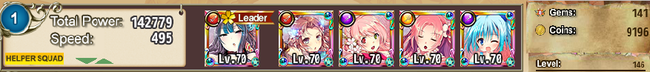
Well, at least you started blending the FKG title text. That's a good start. I'd suggest doing the same with the player ID and numbers too. Those bars just do not look good at all, I'm afraid.
Some of the resized versions also seem to be distorted. Probably from the resizing process. Not sure what program you're using, but there's generally an option to prevent that. Even more so, you could just make the originals smaller to circumvent the problem entirely.
I would also suggest adding borders. If not on all sides, maybe top and bottom. Would make the signatures look more professional.
Not sure how serious you are with this signature workshop and all, but there's my 2 cents. There's plenty of other additions that would nice (i.e., lighting, effects, character blending) but aren't always necessary. Still, good luck to ya brotha.
Results 1 to 10 of 145
- FKG
- Flower Knight Girl Integration
 |  |  |  |  |
 |  |  |  |

 Reply With Quote