


Thanks for the constructive input. What you wrote is actually fairly interesting to me, so let me address each point separately and maybe you could give me some additional viewpoints on the things or advice, as you seem to have a pretty solid grasp on these things.
The reason I want to avoid using just text by itself, is due to the background. As I wrote in some of the previous comments, some of them are very dark and it would make it very hard to read. I might change the color of the text, but honestly I dont wanna do that, as I am striving for a certain uniformity of the layout and the way its displayed. The colored text background serves only as a sight buffer. You glance over the sig. and your eyes are instantly locked on the easy to read player ID numbers (easy to read when compared to numbers without the color buffer). Its not the most elegant solution but it certainly is a valid and easy to implement one. I am trying to make it practical rather than "just pretty". The text bar islef is intentional.Originally Posted by Soltrec

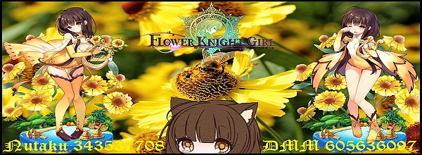
The tool I am using is the Zoner Photo Studio 13. As for the distortion it sometimes happens during the process of making each picture fit. I am using 950x472 Wide/Hight pixel rate for the Full sized ones, and 600x220 for the Signatures (this is the size I came to after experimenting for it to be comprehensible, but not take too much space on the screen.). Some of the pictures are either much smaller, or in opposite, multiple times bigger, so resizing them according to the pixel count may cause some of them get distorted a bit.
Some of them are created through me finding the flower I want to use in a much bigger picture and cropping it out, and then working on it, instead of the parent pic.
Borders....hmm yes that might work. Honestly though I am not a big border fan in pictures myself, (unless its the paling out ending in white yet visible line (or darkening into solid black frame, that also works), it might add to the overall effect.
I will give it a try, but considering the tool I am using It would be better to get a fitting image of the borders from somewhere and use that. Any recommendations ?
Not serious at allI just felt like making these. In the beginning it was just for my own use, later for some more people I consider forum friends. But eventually since bunch of people use just random cut snippets of Print Scrn (some dont know how to make a better sig, some dont have the time, and some just dont care, etc.), I got the idea of offering these to whoever might want one. Its fast to do and looks more personal than just some random cut out.
By no means do I try to be professional here, and while I certainly try to make it better as I go on, given that I do these for fun, and whenever I have some extra time on my hands, it goes only as far as to not cut into my RL time and the hobbies I have.
From what you wrote I have a hunch that you might be either well versed or possibly even a pro - or at least much more invested - when it comes to things like image editing and such, so your standard is definitely set up much higher than mine.
My standard is something more akin to: I'll be making these for as long as people enjoy them, is all.
Results 1 to 10 of 145
- FKG
- Flower Knight Girl Integration
 |  |  |  |  |
 |  |  |  |
Threaded View
-
Last edited by Myrdin; 09-25-2017 at 07:59 AM.

 Reply With Quote