For what it's worth, I rather like the text bar; but would suggest making it semi-transparent if possible. Or, what about ditching the bar and using colored text and a contrasting color outline on the text similar to custom names on this forum?
As for the position of the text, I prefer it centered at the bottom. I personally wouldn't want text above the character; for someone like myself who only plays on Nutaku, it would end up looking lopsided.
+ Reply to Thread
Results 1 to 10 of 145
- FKG
- Flower Knight Girl Integration
 |  |  |  |  |
 |  |  |  |
Hybrid View
-
-
And I am back after a long pause.
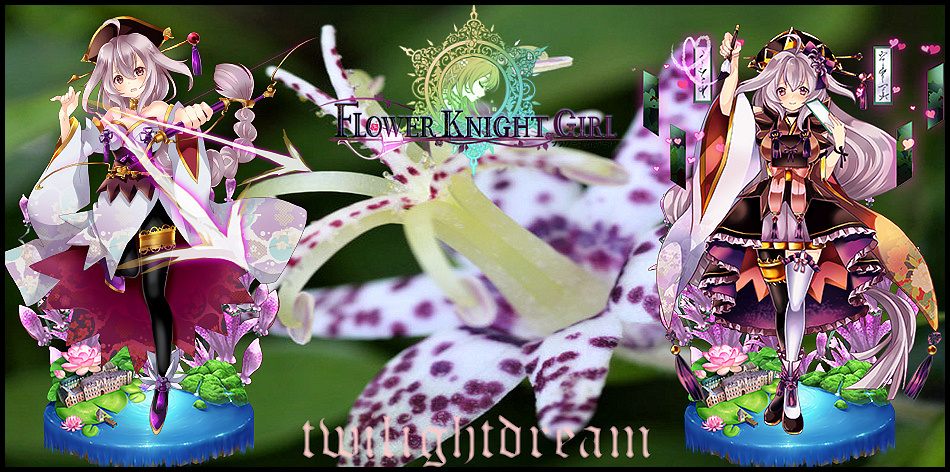
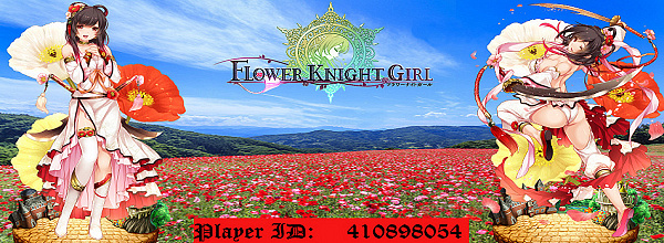
I tried to play with some concepts and re-worked the Signature for twilightdream as per PM.
Since he didnt wish for his Sig. to include ID I opted for some changes and tried to improve the overall concept. Mainly the removal of both white frames and the use of bigger transparent colored text on the bottom.
*The problem is the FKG logo is to transparent on a darker picture, just as I feared its hard to see, sigh.
Toad Lily
*For people who already have one of my signatures. Should you like the new setup, I can redo yours with the transparent logo and text.
So let me know.Last edited by Myrdin; 10-22-2017 at 07:46 AM.
-
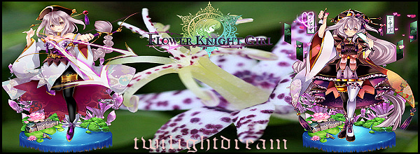
What I used to do for text in signatures long ago, was to find two contrasting colors or shades within the image, set one as basecolor for the font (use the color picker!), and the other as a very thin outline. Usually, I picked the lighter shade as a basecolor, with the darker shade as an outline, but occasionally the other way round worked out better.
That way, you usually get two colors that won't clash with the image, while the result is generally fairly readable because either the font or it's outline will usually have a contrasting shade against the background.
So in for example the Toad Lilly siganture, I'd probably pick a very pale yellow from her unevolved garter as the main color, and a very dark shade of purple from the bottom of her evolved dress as the outline color.
The pale purple from her evolved stocking as basecolor with the orange from that piece of her evolved dress as an outline color might work too, by the way.
-
tl;dr
Just picked up a few lines cuz I'm lazy. But from what I could see, here's my opinion as someone who had his time with photoshop and this kinda stuff: Signatures with lots of visual appealing stuff on it will never blend well with text, because there will always be too much color, making it 'impossible' to make a text viable. It could only work a little better with small text with a font that follows the flow of the signature and has its principal color in a darker tone.
But anyway, your style is pretty good already. No one is demanding a piece of art to score #1.
Also, the transparent Logo(without white background) looks much better.Last edited by Handu; 10-14-2017 at 04:27 PM.
-
Thanks for the feedback guys.
Since I am not using photoshop the amount of stuff I can do is limited. I tried to fiddle around with it, but the program I am using is very simplistic and does not allow for stuff like Text outlines (I wish it did tbh). If I could that would make the whole thing much easier.
-
I'm still using a very old version of Photoshop, which didn't have very convenient text outlines either. However, it does place new text on a new layer, and the layer does have an outline feature, which basically gives the same result. (to be honest, I still miss my old JASC Paintshop Pro 7.04. It was way more intuitive than Photoshop, which had, and still has, way too many totally useless features cluttering the interface). Really wish I could still get that specific version somewhere, immediately after Corel took over, that program went to hell.
 Originally Posted by Myrdin

-
I use a mixture of Elements 6 (very old but it works), Photoshop, Inkscape, and GifScript to do my stuff. It works well enough for most projects.
Flower Knight Commander | IGN: Ampchan | FKGID: 300316473 | Discord Name: Ampchan
Total Power: 658K | 41/52 Current Allies | Level 165 | FKG Discord Channel
 Reply With Quote