tl;dr
Just picked up a few lines cuz I'm lazy. But from what I could see, here's my opinion as someone who had his time with photoshop and this kinda stuff: Signatures with lots of visual appealing stuff on it will never blend well with text, because there will always be too much color, making it 'impossible' to make a text viable. It could only work a little better with small text with a font that follows the flow of the signature and has its principal color in a darker tone.
But anyway, your style is pretty good already. No one is demanding a piece of art to score #1.
Also, the transparent Logo(without white background) looks much better.
+ Reply to Thread
Results 1 to 10 of 145
- FKG
- Flower Knight Girl Integration
 |  |  |  |  |
 |  |  |  |
Hybrid View
-
Last edited by Handu; 10-14-2017 at 04:27 PM.
-
Thanks for the feedback guys.
Since I am not using photoshop the amount of stuff I can do is limited. I tried to fiddle around with it, but the program I am using is very simplistic and does not allow for stuff like Text outlines (I wish it did tbh). If I could that would make the whole thing much easier.
-
I'm still using a very old version of Photoshop, which didn't have very convenient text outlines either. However, it does place new text on a new layer, and the layer does have an outline feature, which basically gives the same result. (to be honest, I still miss my old JASC Paintshop Pro 7.04. It was way more intuitive than Photoshop, which had, and still has, way too many totally useless features cluttering the interface). Really wish I could still get that specific version somewhere, immediately after Corel took over, that program went to hell.
 Originally Posted by Myrdin


-
I use a mixture of Elements 6 (very old but it works), Photoshop, Inkscape, and GifScript to do my stuff. It works well enough for most projects.
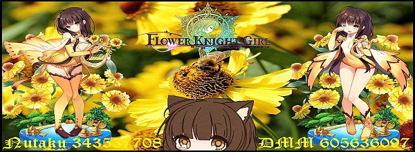
Flower Knight Commander | IGN: Ampchan | FKGID: 300316473 | Discord Name: Ampchan
Total Power: 658K | 41/52 Current Allies | Level 165 | FKG Discord Channel
-
Hi Myrdin, finally got the time to post here.
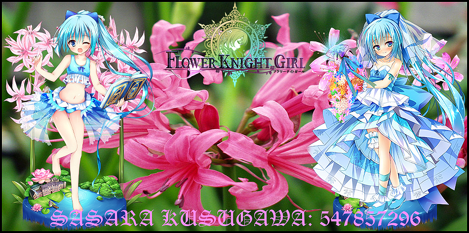
So, yes, I would like a Nerine signature. Btw, I would like to ask a special request, if you don't mind. Can you do the Nerine signature like how you did for Twilight? What I mean is, combining both versions of Nerine, the 6★ and the 5★ one. Reason is because when I was thinking about Nerine (June Bride), both her pre-evolved and evolved forms feature her facing to the left so I don't feel like it's uniform if you place them both together. However, if you combine the 6★ evolved version (on the left) with the 5★ evolved one (on the right), then I think it will look nice, just like how you did for Twilight. *waiting to see the moffu side of the force*
Here's my Nutaku ID: 547857296. I think I'll like to go with the option of putting in my forum name with the player ID, since I'm using the same name for both of them. Something like this; SASARA KUSUGAWA: 547857296
Oh, before I forget, I also did some research on my own. You can use it if you like it. Personally, I love this image. It's got some space on the left and right, and the colour of the flowers showcased here looks absolutely gorgeous. Seriously, I've never adored pictures of flowers this much before. So, you wanna use it, or not? (I think you're gonna use it, hehe XD)

-
Request noted.
Sure it can be done. There is not that many people around here anymore, and not everyone wants a signature so I think combining them wont hurt.
Should be able to get it tomorrow or during the weekend.
-
And here it is.
Since you added your own picture to the request, I used that one. While I would have used the Bloomed artwork personally if it was me, you asked for the Evolved.
As for the text I went with a brighter color. I wanted to use bright blue but it didnt mesh well unfortunately.
Nerine
*I applied a new concept recommended to me from the previous conversations, that being adding borders to the signature.
It looks good. Kinda gives of the feel of those magnet stickers you buy on a vacation and then put on the fridge or something, which is neat moff moff :3
I think this is the standard I will be using from now on. While the issue with the bottom text still remains (mofu grrr >3), I think the overall quality of the signatures improved over the first ones I made.Last edited by Myrdin; 10-21-2017 at 02:09 AM.

 Reply With Quote